


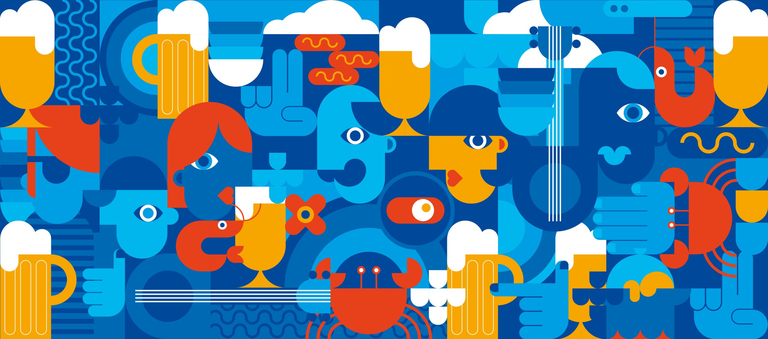
Established in 1925, Portugália began as Lisbon’s first beer factory and soon evolved into a beloved restaurant. Over the decades, it became a national icon, now present across Portugal with 40 locations from north to south.
The brand’s origin dates back to 1916, when growing anti-German sentiment led to the rebranding of the former Germania brewery. Portugália emerged as a proudly patriotic name, reflecting the national spirit of the time.
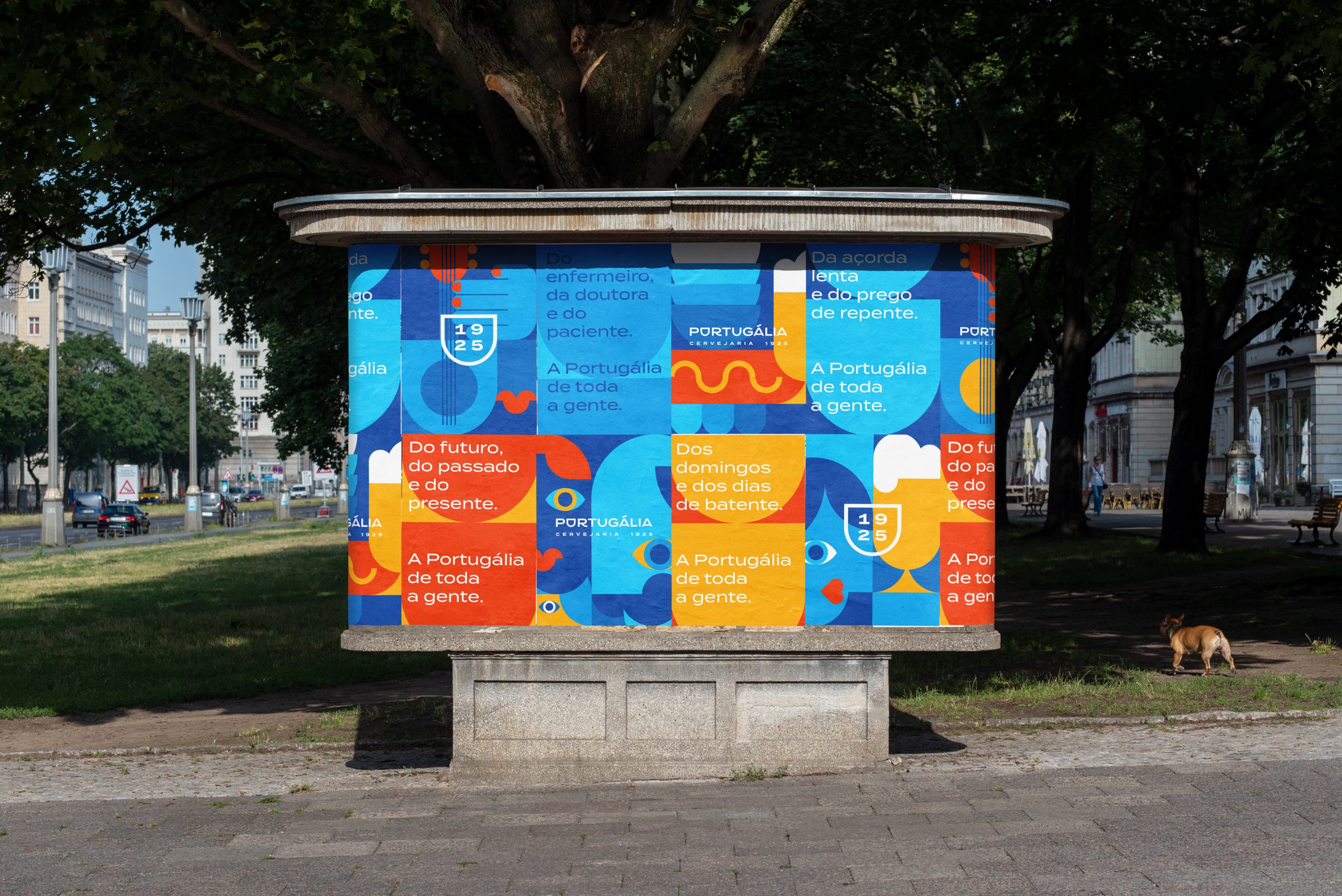
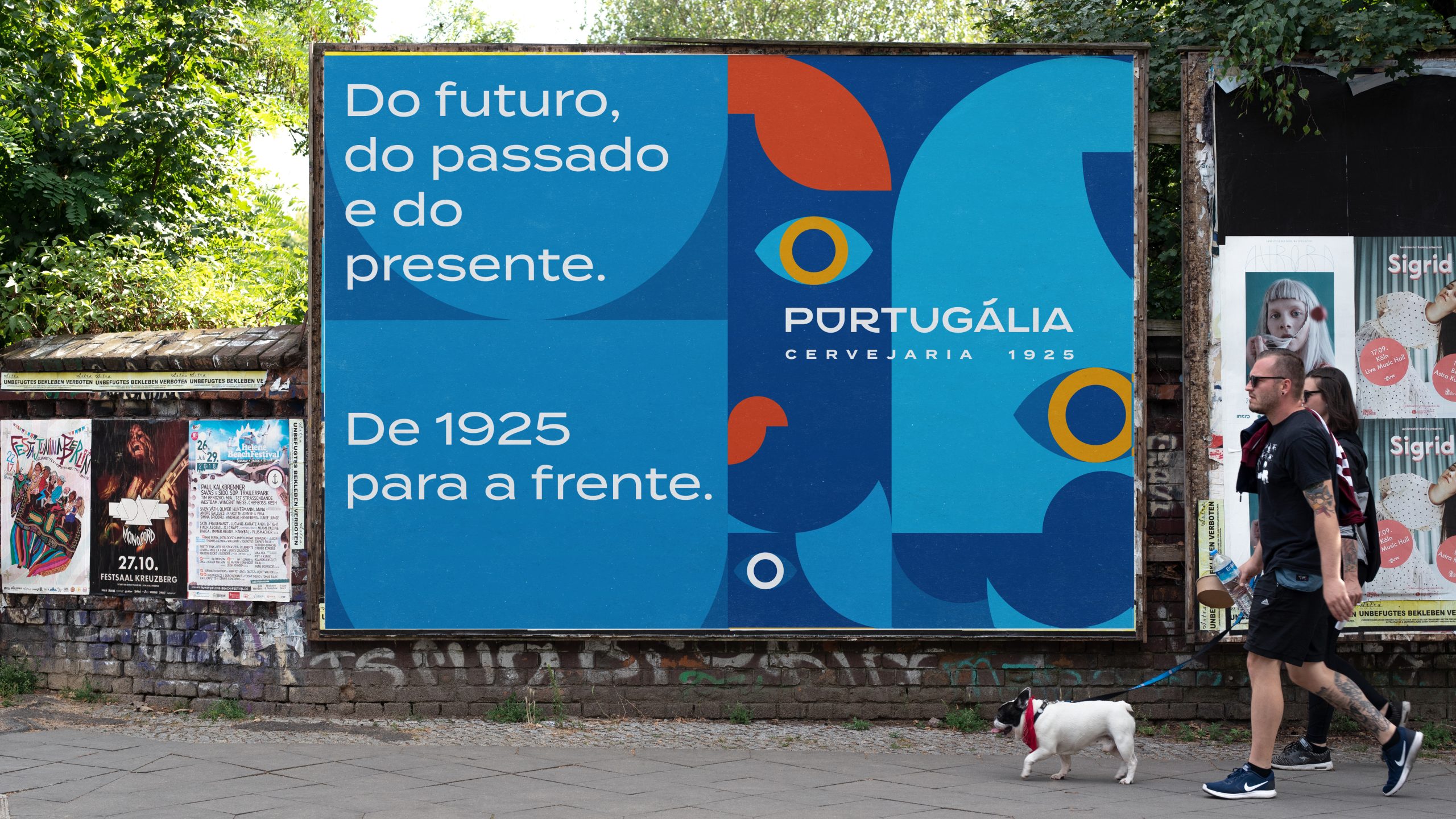
Today, the brand is embracing a new identity—one that reflects a modern Portugal: diverse, cosmopolitan, and open to the world.
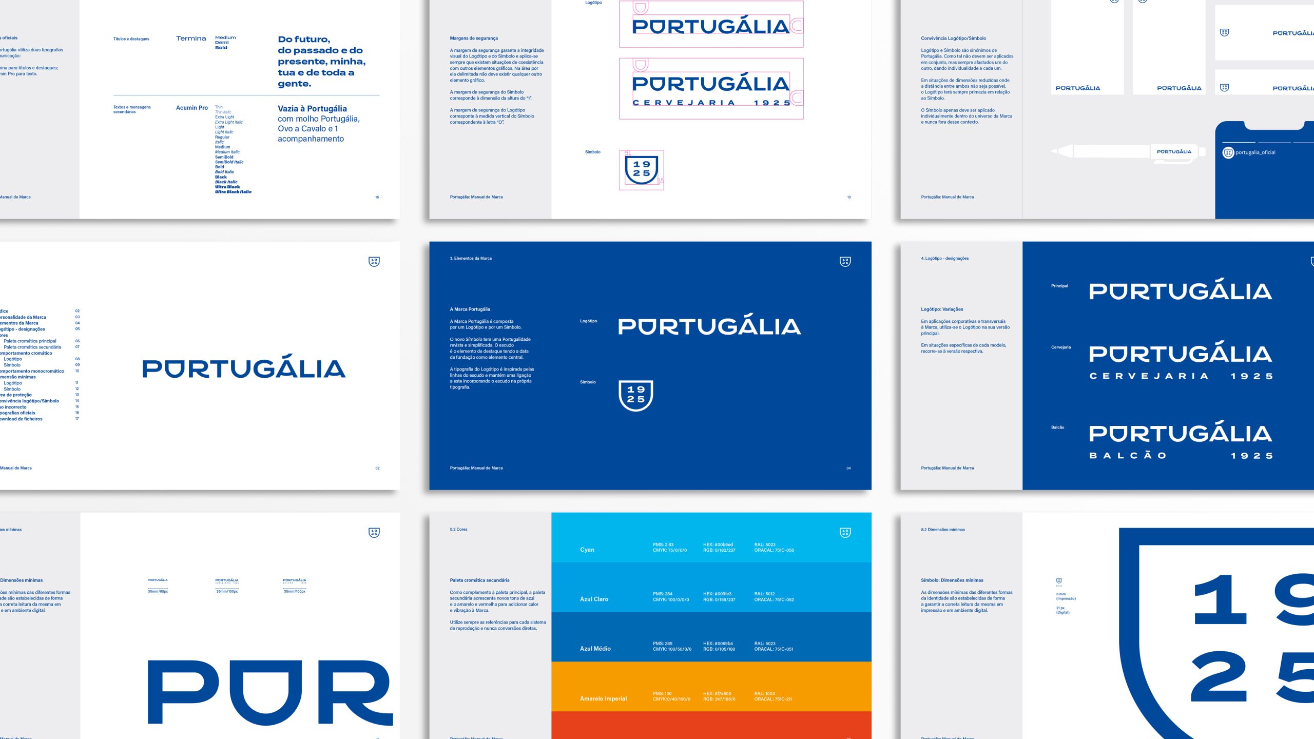
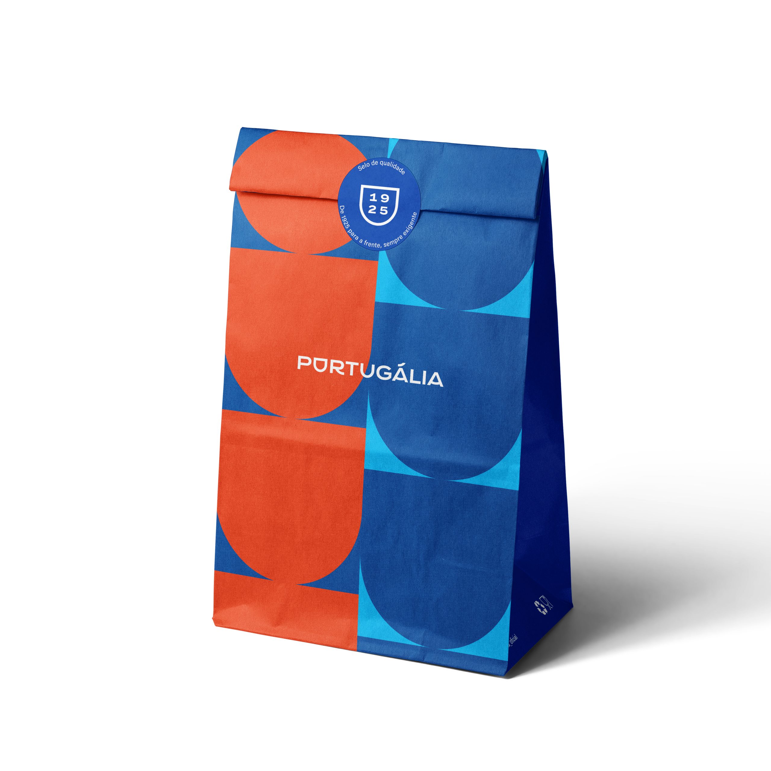
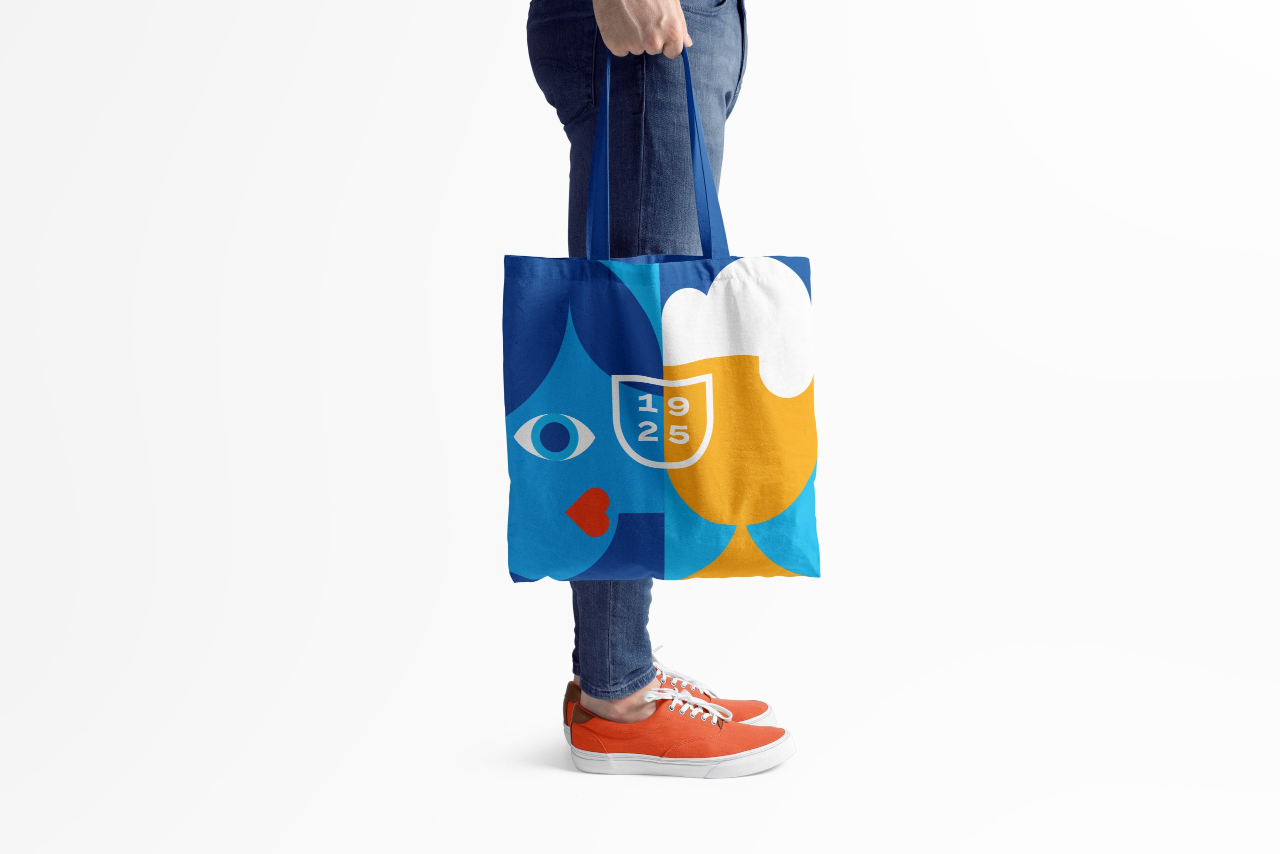
Symbol: The shield remains the central graphic element, now reimagined with a minimalist design that invites fresh interpretations and versatile applications.
Heritage Meets Modernity: The founding year takes center stage, honoring Portugália’s legacy through a clean, contemporary visual style.
Distinctive and Expansive: A custom typeface draws inspiration from the shield’s lines, while its extended form symbolizes the brand’s growth and renewed breadth.
Design and Creative Direction: Farelo Studio + Luis Mileu Studio
Copywriting: Ricardo Henriques
3D Design: Pedro Duarte
Store and staff photos: Nuno Sousa Dias
Azulejo-escudo photo & video: Pluma
Motion Graphics: Fatelaz
Sound: DJ Glue