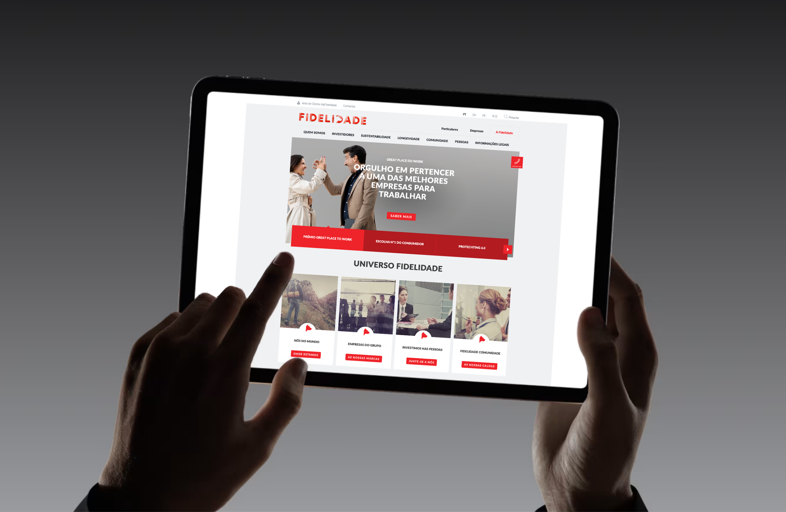

Fidelidade, the leading insurance group in Portugal, faced a pivotal moment in its evolution: unifying its operations under a single, cohesive brand. As of today, Fidelidade becomes the unique brand identity for the group, consolidating the previously separate Fidelidade Mundial and Império Bonança brands. This rebranding reflects the successful merger of the two companies, completed over the past year, which has delivered significant gains in efficiency and productivity.
The new identity of Fidelidade reflects the legacy of its verbal, chromatic, and symbolic heritage. This unique brand reinterprets the traditions of Portugal’s oldest and most iconic insurance companies with a forward-looking perspective. The integrated brands that now form Fidelidade represent over 200 years of history, which are embedded in the elements of the new visual identity.
The Name: The name “Fidelidade” emphasizes the value of the word and its meaning, underscoring the trust and loyalty the company fosters with its clients and partners. The
Symbol: The dog, representing loyalty, remains central to the identity, with a modern, three-dimensional design that reinforces the insurer’s dedication to its clients, partners, commitments, and values.
The Color: Red, historically associated with insurance companies, brings energy and motivation, symbolizing a dynamic and positive presence in the market.


